Today market is cluttered with competing brands and media, marketers have to exploit all angles of a brand's experience with the consumer. Given the various media choices and market fragmentation, marketing tools are being reviewed, and more emphasis is being put on packaging.
Packaging has often been called the 'silent salesman'. Packaging can be the source of visual inspiration. Packaging is essential in creating the brand image that comes to mind when discussing a brand. So, it is time the silent salesman was silent no longer.
Packaging Design as Competitive Strategy
Once economic crisis hit throughout Asia, Indonesia is severely hit by this turmoil. The short-term side effect has been a temporary slowdown in domestic demand and economic growth. And a good business sentiment is needed to improve the market climate.
Some of the changes in consumer behavior when economic crisis happened is that everybody will have to lower their standard of living – for example, somebody who used to use liquid soaps will use bar soaps and somebody who used to use bar soap will use ‘sabun colek’.

With previous experience facing economic crisis in various country, Blue Band quickly anticipate this problem. Since the packaging cost is prohibitively expensive compare to the packaged goods, tin packaging will have to be changed to carton packaging.
The packaging should also act as a point of sales since in rural and remote area the product will be self-displayed in small kiosk as the main distribution point. People will buy margarine by weight instead of buying them in a package. A simple design solution is crafted using a longer flap for the top flange and put a graphic that is used as a self-display.
Unluckily, bakery expressed their concern since changing the package will affect margarine flavor as their utmost selling point.
Then the packaging design serves the purpose for keeping the brand competitive and self sustain during the economic crisis. Today Blue Band has retained its leadership as the leading brand in margarine.
Packaging Design as Storytelling
What makes multinational brands want to cater to market that has a very low per capita consumption. It means large untapped potential!
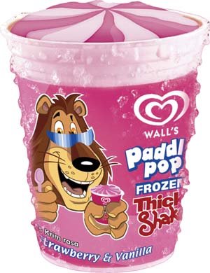 Indonesia has lower ice cream consumption than many other countries. In order to educate the market, Wall’s starting at the very early age. Through Paddle Pop, its flagship brand for kids, they build brand stature through various creative strategy, such as creating adventure story for Paddle Pop Lion mascot. Its rainbow colors and fun flavors are a hit! The Paddle Pop Lion is the friendly face of fun and adventure and this ice-cream rates the fastest selling and most popular ice-cream among school-going children.
Before the concept story unfold, it started with various possible direction. Packaging plays an important role to define the visual direction for the story. It is then adapted to various application such as point of sales, range card and other promotional items.
Through activities, media, promotion and packaging, Unilever engage 360° marketing strategy to create a personal experience for the consumer. In this case, packaging become one of the end vehicle to fulfill kid’s imagination in enhancing the experience.
Millward Brown was hired to evaluate the strategy and its effectiveness. This study then used as a base for the next year strategy.
Within the past 7 years, Wall’s compound annual growth in Indonesia has replaced Thailand as the brand development center. The packaging design was then adopted as the visual direction and inspiration for other countries, such as Thailand and Singapore.
Packaging Design as International Gateway
A cassava chip is a slim slice of a cassava deep fried or baked until crisp. This chips serve as an appetizer or snack. Commercial varieties are packaged for sale, usually in bags. The simplest chips are simply cooked and salted, but manufacturers can add a wide variety of seasonings. Cassava chip is considered an export commodity.
Kusuka is created as a strategy to optimize factory production cycle. Instead of using common distribution channel, this product is spread through Mum’s network because the factory won’t be able to commit the product continuous supply. This unique distribution methods quickly become ‘word of mouth’ strategy and people start looking for the product.
 Conventional clear plastic packaging soon replaced by a new packaging design. A design study is conducted considering Kusuka will compete with other products on hypermarket shelves. Hypermarkets are becoming increasingly important for the consumer retail business. Also known as 'non-selling floors’, these environment allow consumers to browse unaided through rows of boxes, following a 'scan-and-choose' purchase procedure. This distribution model has intensified the packaging design role within a marketing strategy. Rather than merely protecting products, packaging, together with the supporting point of sale and retail solutions, has become the means to sell them, the 'silent salesman' that triggers consumers in their selection process.
The final design solution use combination of yellow and green to create a very appetizing look. Client’s favorite element is the use of the product photo from above. With the new design, consumer quickly identify Kusuka as the leading brand in cassava chip.
Even the big brand curiously and continuously watch this new player and before long, they started to copy the product. Some of the key feature that keep Kusuka as the leading brand is the product experience, unique distribution point and fresh look packaging design.
At the moment, Kusuka enjoys a high growth demand in local market and started become an export darling. It has just been introduced to Phillipines and distributed to various other countries through Alibaba.com, the leading global trader website.
 Packaging Design as Brand Strategy
Trends towards healthier eating and an increasing interest in more organic products are the key reasons for the growth in fruit juice market. Healthy living is a growing trend and people just can't get enough of these kinds of products. It was then a commodity product and takes times to prepare. And consumers are demanding high quality premium products.
Based on this idea, Mama Roz brand is created. Starting with the name, it signifies the product is prepared by human being in a warm environment, freshly produce and prepared everyday to the consumer door. The identity gives a living brand personality. The use of warm color and stylized photo illustration engage an emotional relationship towards the brand promise.
 One of the challenges in mixed juice is that they don’t blend very well. Therefore an opaque bottle is used surrounded by nicely designed label.
This key identity then defines the whole campaign, from packaging to advertising. Consistent look and feel communicates the brand promise in a credible and convincing way.
The future lies in an integration of harmonized solution media channels and communication. We are talking about marketing communications, point of sales materials, retail environments and packaging.
To create a complete brand experience, every single product communication activity will become an important tool within a total brand communications arsenal. The packaging could no longer be a silent salesman.
* This article will be published in international packaging magazine.
Andi S. Boediman is an award winning designer living in Jakarta – Indonesia. His design is awarded The Best Creative Graphic Design by IdN (International Design Network) and has been exhibited in Singapore, Hongkong, USA. His works has been published by PIE Books, Japan. He is the founder of Admire – Integrated Marketing Communication (www.admire.co.id), which serves international clients such as Unilever, Timezone and many others.
No comments:
Post a Comment